Accessibility Resources
Heading tags
When you arrive for the first time at a page, you are likely to scan the document to get an overview of the page. This will help you decide if you want to stay and where you will want to start reading. Visually disabled users who use screen readers to access websites and documents will want to do the equivalent. They may scan the page by tabbing through the headings to find what they are looking for.
If you have a fair amount of content that does not have any headings, the screen reader user may have a hard time reviewing content when going back to review, as the document or page is not very navigable. The user will not have the ability to tab around the page easily to find or preview content.
Heading Level Hierarchy
Heading 2, Heading 3, Heading 4, Heading 5, and Heading 6 are style tags that can be used in a Drupal page. The numbering should reflect a outline-like hierarchy that fits with the content, and with the headings already assigned on the page. This is important for accessibility compliance and increases search engine optimization.
The drop-down menu for Paragraph Format is located in the dropdown that says "Normal" at the top. Do not use Heading 1 - it is reserved for the page title. If you copy text from other sources that bring over formatting, you may end up with a Heading 1 or Heading 2 in your copied text. Using one of the removing formatting options (hover over the icons in the toolbar to see what they do) will remove the heading tags, allowing you to assign the correct tag from this drop down.
NOTE: It is important that headings be properly used; they are for organizing information and NOT for styling text. For that reason, they must be used in logical order: A Heading 4 tag does not immediately follow a Heading 1 tag. You can follow a Heading 3 tag with a Heading 2 tag, however, if you have organized the information into logically similar sections.

Hyperlinks
There are a few important considerations when creating hyperlinks:
- Make unique, descriptive hyperlink text.
- Never make more than one link on a page have the same hyperlink text but go to different locations. (e.g. two links that say "Read More", but go to different pages).
- Do not use uninformative link text such as "Click Here" or "Click For Details",
"Read More"= BAD
"Read more about cute kitties."= GOOD - Make links as concise as possible while still being informative. Don't make a whole paragraph be a link.
- Don't make your link area too small, such as one very short word, in consideration of those with mobility issues.
- Avoid URLs as the hyperlink text, unless the URL is short.
- Do not have empty links.
- In most cases, you should not have your links open to a new window, as this can be confusing for the screen reader user. There are cases where you still might want to do this, consider notifying the viewer.
Alternative Text for Images
When placing images onto web pages it is important to add what is called “alternative text” so that visually disabled viewers using screen readers will have information about the image. Ideally alternative text should be a short phrase that succinctly describes the image.
When you upload an image into Drupal 8, you will be required to add alternative text.
Basic Tips on Writing Alternative Text
- Use words as opposed to abbreviations.
- Write a phrase that is succinct, but adequately describes the image.
- If there is text in the image that is important, that should be included in the alternative text.
- Don't include "Image of ..." or "Graphic of...". Screen reader software announces "graphic" before reading the alt text.
See the article on the WebAIM site about writing effective alternative text
Empty Alternative Text
If an image is truly decorative only - meaning it adds no value to the content other than looking pretty, or the explanation for the image is in the body text right next to the image - you can put "" (two sets of quotation marks) into the alt text field. This will tell screen readers to ignore the image.
Table Cell Headers
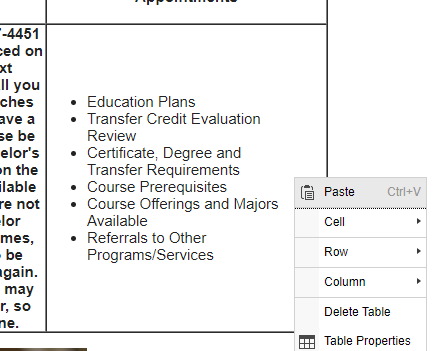
Table cell headers are important for accessibility compliance and visually help your viewers understand the relationship between cells that define content to the cells below or to the right or left of the header cell. Most commonly, table cell headers are used in the first row to define content for the cells below them. You can set table cells to be header cells in the Table Properties or Cell Properties.

Testing a Site with Siteimprove
SRJC has a subscription to Siteimprove, which is a tool to help check your site for broken links, misspellings, and accessibility compliance. Additionally, there is a robust analytics module to help track your site traffic. If your department has not been getting reports sent to you, contact the Web Team in IT to get set up to use this tool. Reports get sent by email to users every five days.
Accessibility Compliance of PDFs
Effort should be made to make accessibility compliant PDFs.
- See the Creating Accessible PDF Documents page on the Web Accessibility site for Distance Education for information on making PDFs accessible.
- A necessary tool in PDF accessibility work is Adobe Acrobat Pro. All employees using District computers can get access to this program by inquiring through IT.
- Siteimprove has a tool to check the accessibility of PDFs.
Accessibility Compliance of Word Documents
Word documents may also need some work to make them accessibility compliant. See the Creating Accessible Word Documents PDF for information on making Word documents accessible.
Learn how to make a Word document on PC accessible, or how to make a Word document accessible on a Mac.